Freaky Fonts — Why “Weird” Type Is Taking Over 2025
1. Why designers are obsessing over freaky type
It stops the scroll. Jagged, off-beat letterforms jump out in TikTok, Pinterest and Reels feeds, boosting engagement in seconds.
It adds instant personality. A headline that looks hand-cut or marker-smeared tells a story before the reader even parses the words.
It pairs with AI visuals. Generative art is wild and experimental; “safe” typography fades into the background. Freaky fonts hold their own.
2. What counts as a freaky font?
Uneven geometry – characters feel hand-trimmed or doodled.
Extreme proportions – ultra-condensed or super-wide shapes shout for attention.
Built-in texture – woodgrain, photocopy noise, paint splatters add depth.
Instant vibe – one glance and you think zine culture, vintage surf, or punk flyer.
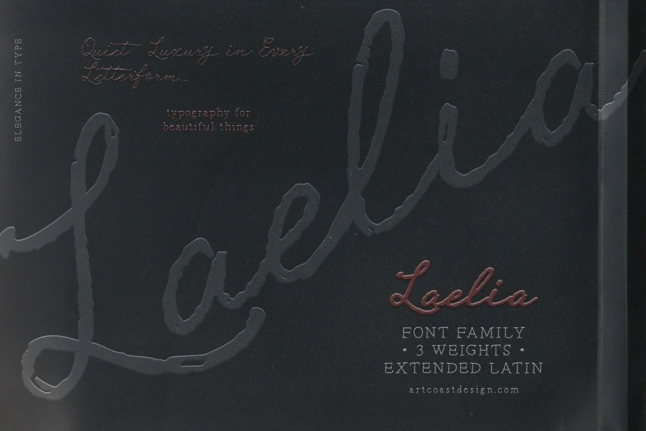
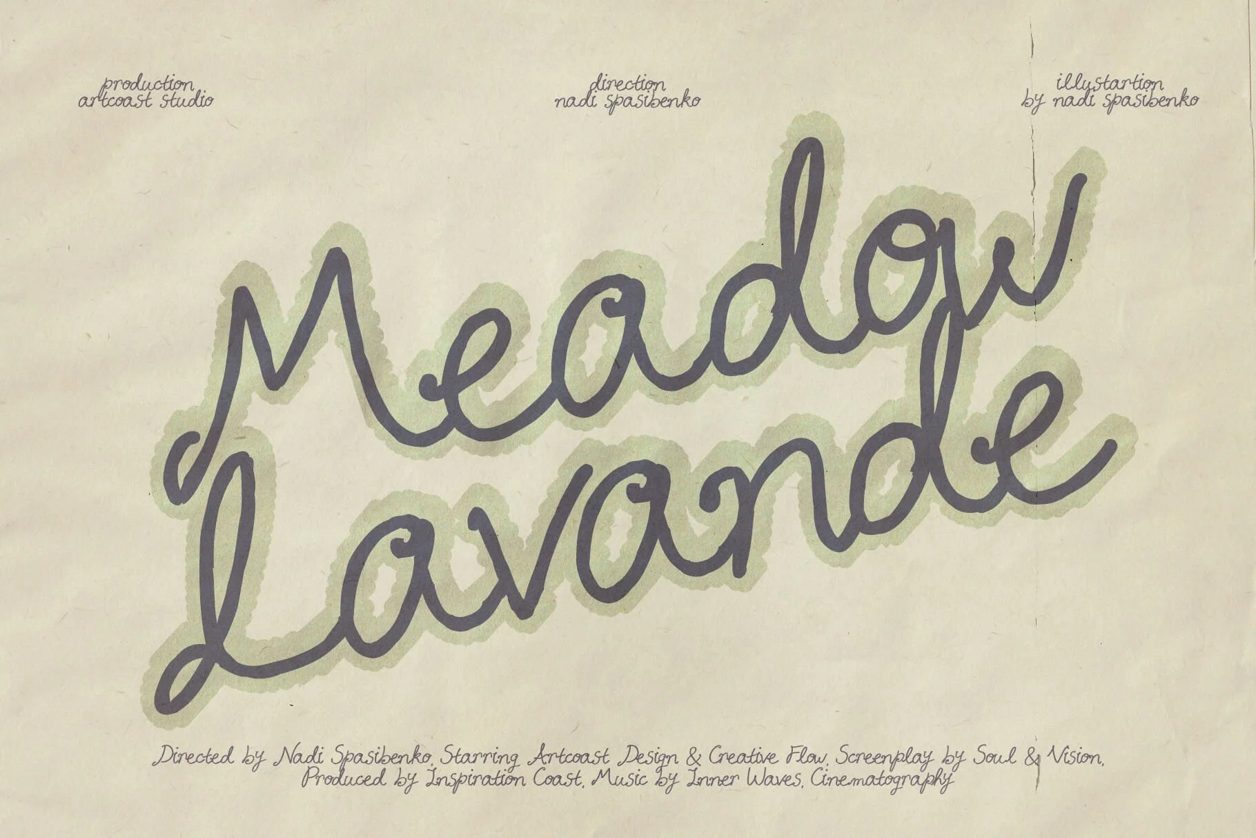
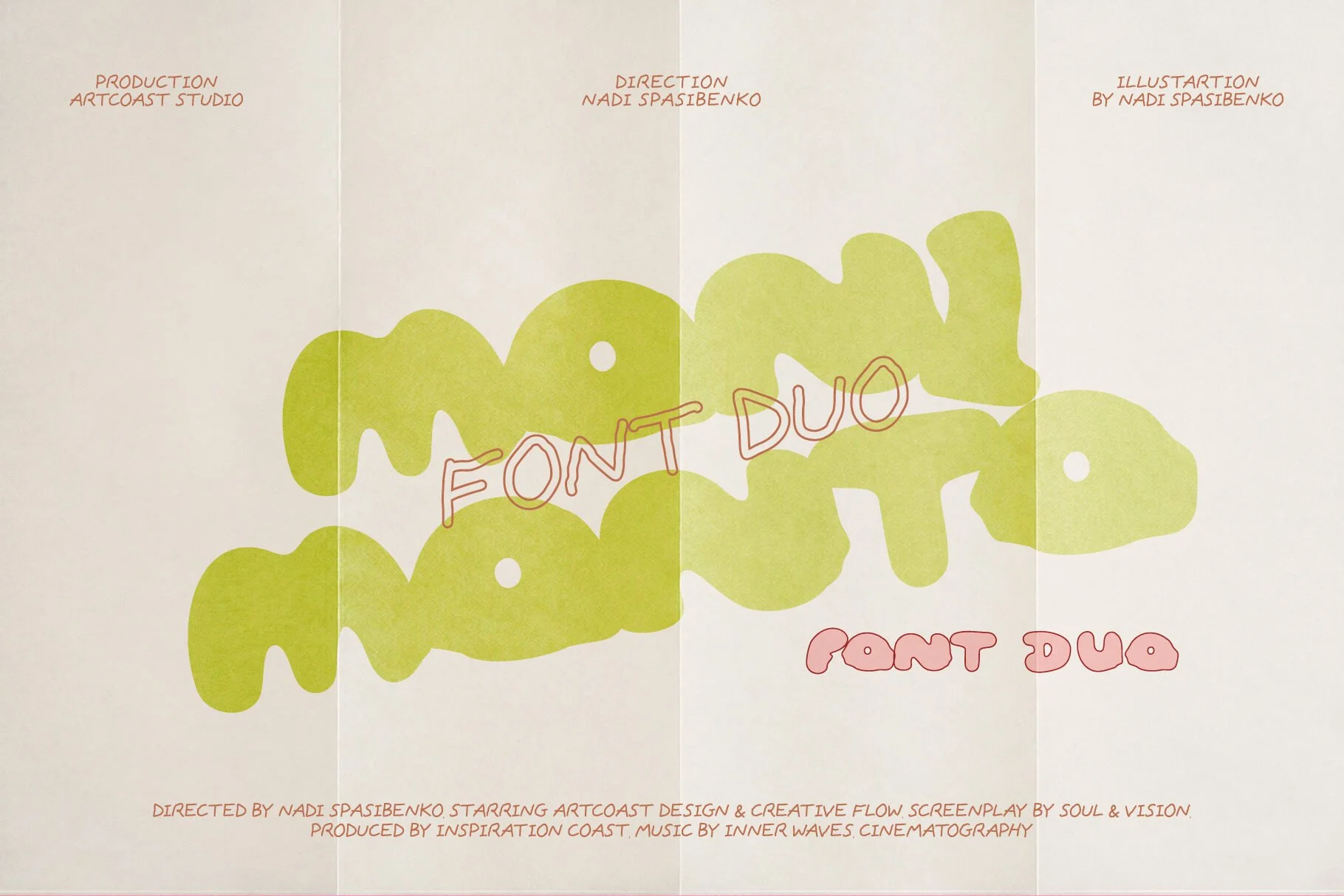
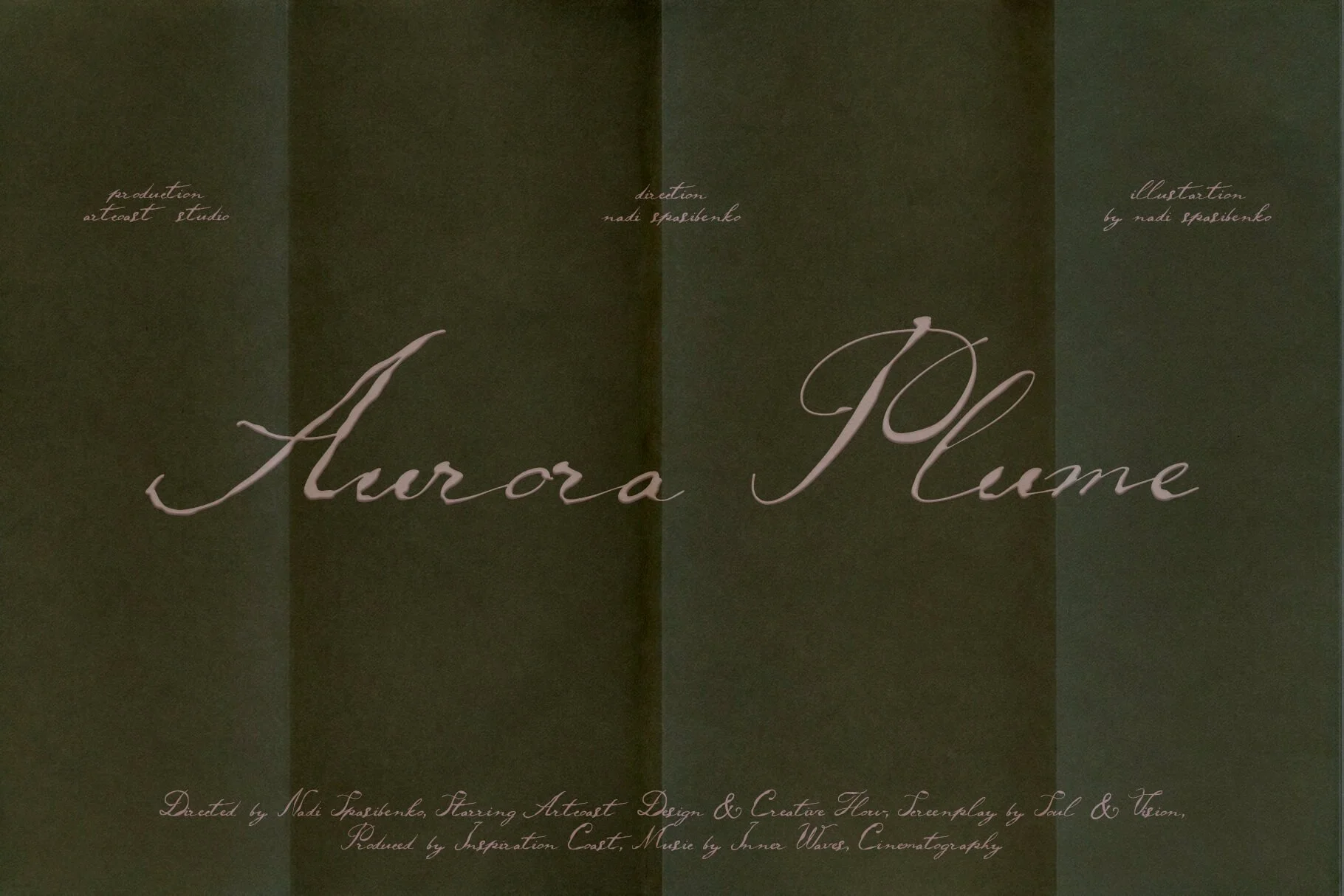
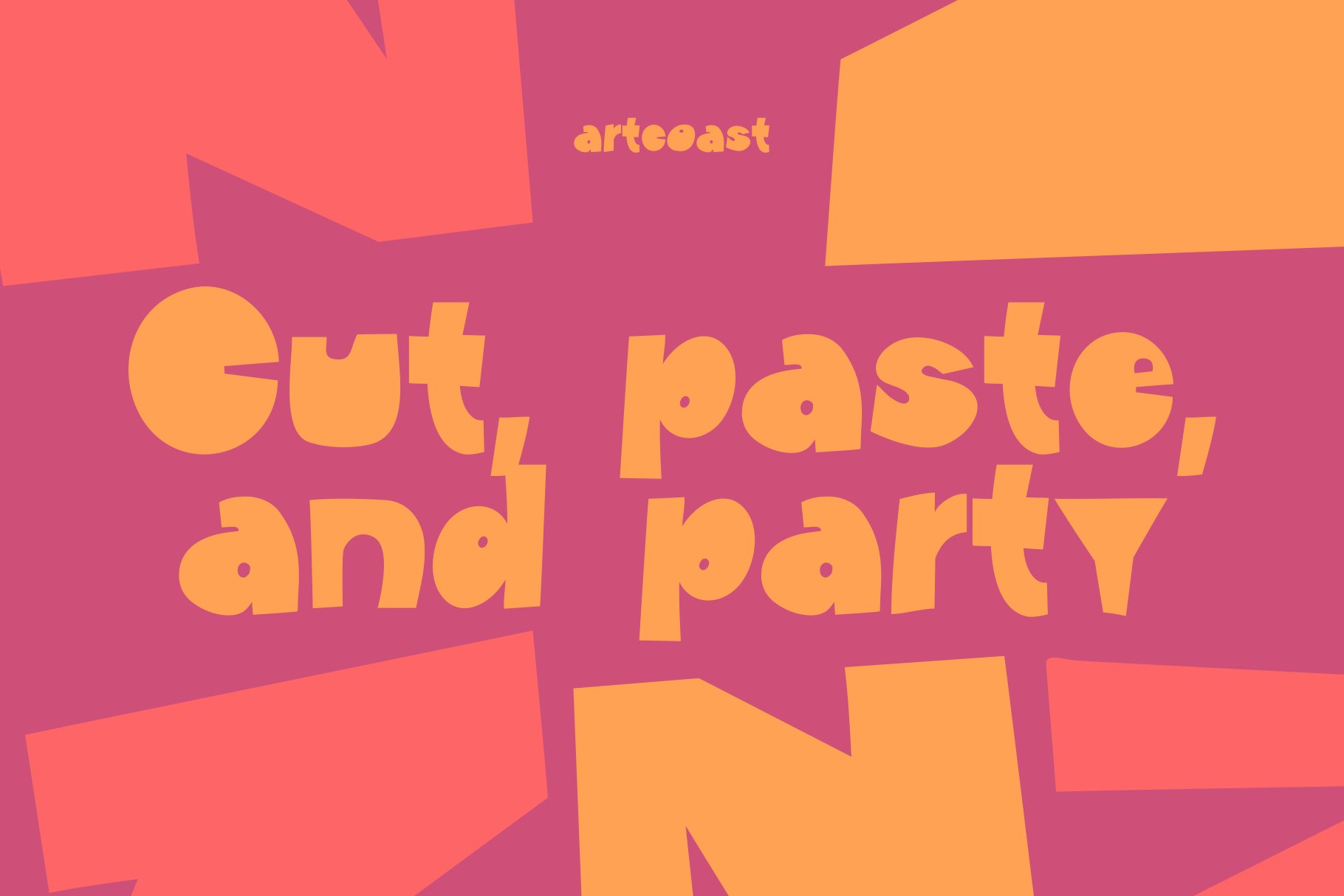
3. Seven Artcoast fonts to try
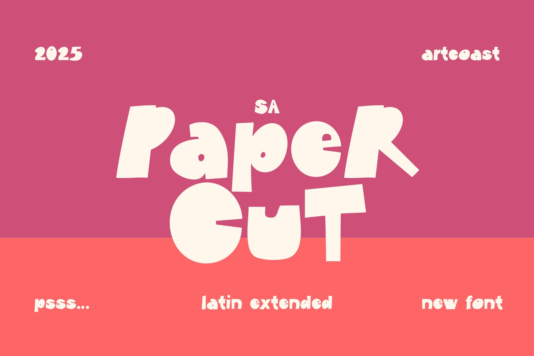
SA Paper Cut – knife-edge letters that look literally snipped with scissors. Ideal for indie-band posters or collage-style artwork.
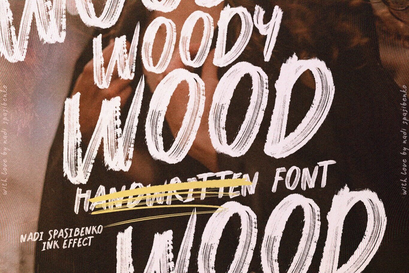
Rustic Woody Wood – rough-sawn texture perfect for craft-coffee packaging or farmers-market signage.
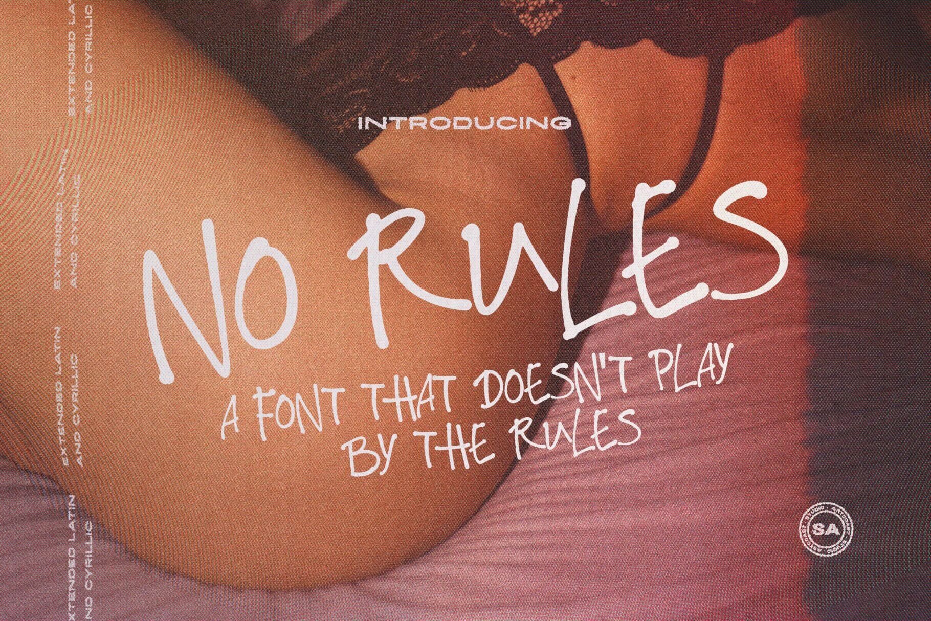
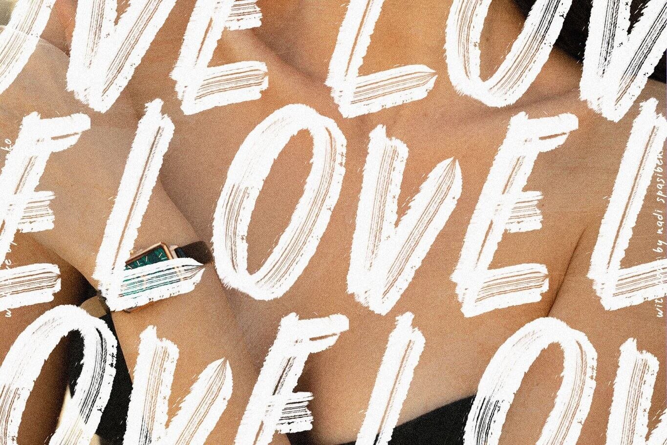
SA No Rules – anarchic marker script that screams on podcast covers and edgy merch.
SA Smoothie Bold – thick, drippy strokes made for fun beverage labels and youth-centric ads.
Watermelon Sorbet – soft, “gummy” forms that fit summer campaigns, beauty reels and anything Gen Z.
SA Vredina Thin – ultra-skinny drama for EDM flyers and high-fashion lookbooks.
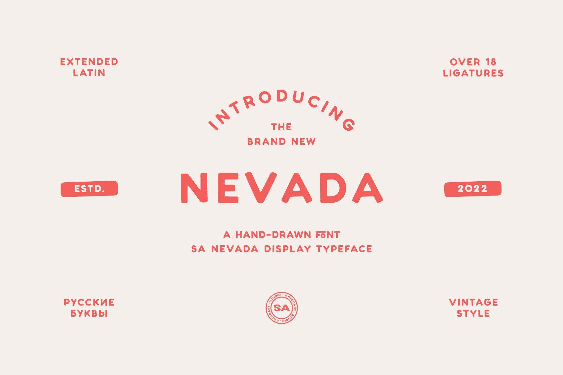
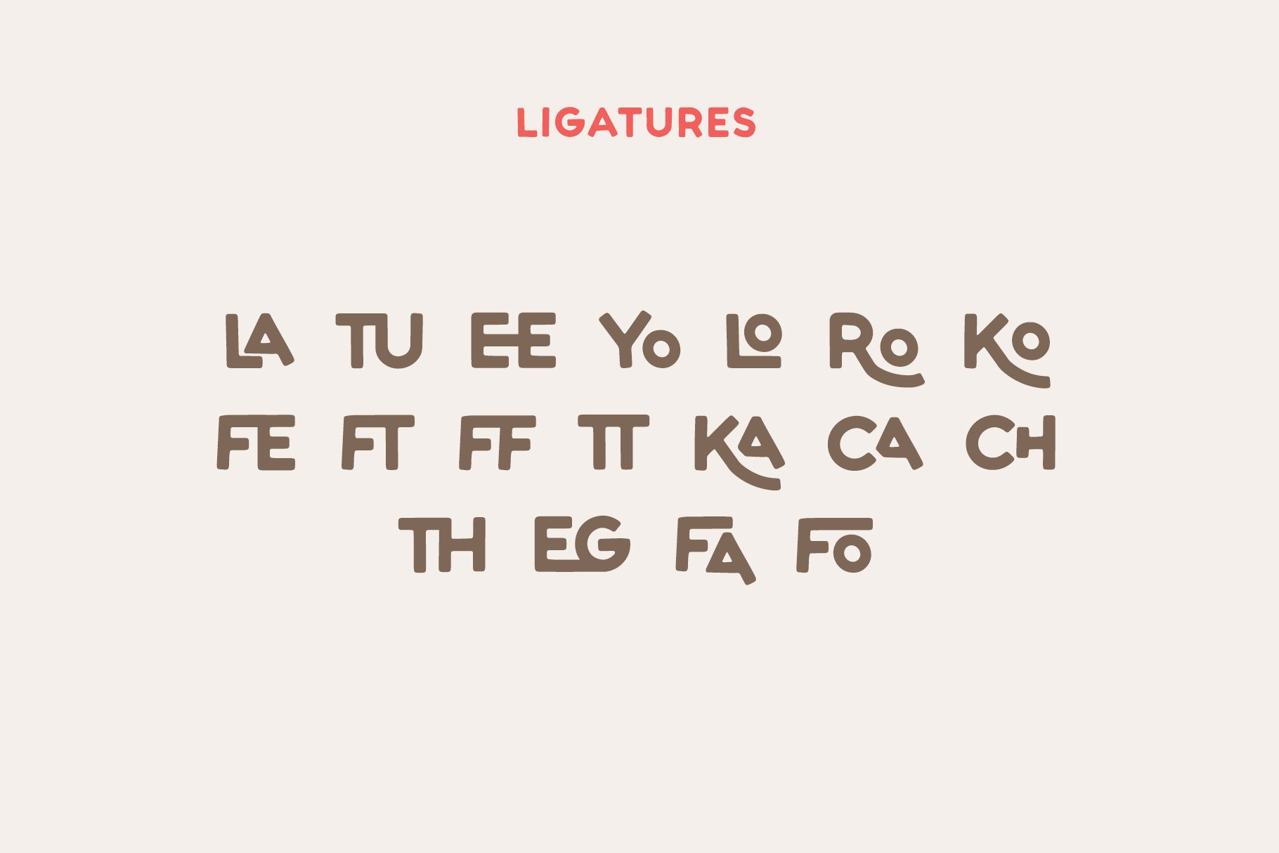
Vintage Nevada – dusty ’70s Western energy for throwback bar menus or vinyl-release artwork.
All Artcoast fonts include Extended Latin, ship in OTF/TTF + web formats, and come with a commercial license.

4. How to use freaky fonts without wrecking your layout
Let them solo. Keep body copy in a neutral sans or serif so the headline can shine.
Add breathing room. Irregular shapes need extra letter-spacing and generous margins.
Match the color to the mood. Pastels feel nostalgic; neons crank up the chaos.
Skip heavy effects. One freaky font plus bold color is enough—drop shadows and gradients usually muddy the look.
5. License & technical cheat-sheet
Commercial use is included – logos, packaging, ads, social posts, unlimited prints.
Ready for every tool – works out-of-the-box in Figma, Adobe apps, Canva, Webflow, Squarespace, WordPress.
Instant download – get the files seconds after checkout; no subscription required.
2025 audiences crave design that feels human and a little unruly. One well-chosen freaky font from Artcoast plus a bold palette can make your next project leap off the screen.
👉 Explore the full collection and grab free testers here: artcoastdesign.com/shop/fonts — stay weird and keep designing!