
In the world of high-end design, screaming for attention is out. Whispering is in.
As we move into 2026, the biggest trend in visual identity is "Quiet Luxury" (or "Old Money Aesthetic"). It’s about minimalism, plenty of white space, and, most importantly, typography that carries the weight of history but feels sharply modern.
Enter SA Killeen. This isn't just a font; it's a design hack for making any brand look instantly more expensive. Here is why this modern serif is becoming a staple for designers in New York, London, and Paris—and how you can use it to upgrade your projects.
1. It’s All About the Contrast
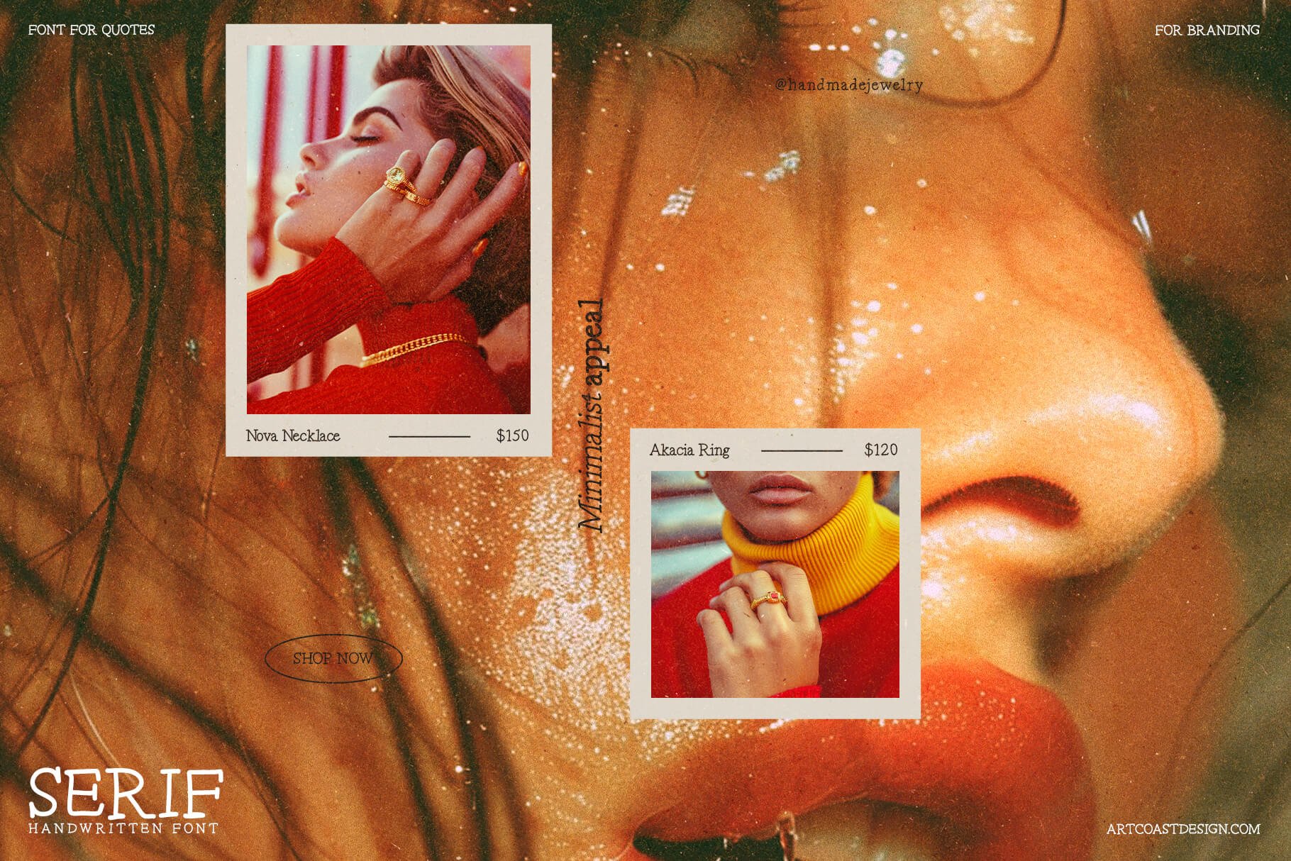
The secret to SA Killeen’s elegance lies in the extreme difference between its thick and thin lines. This high contrast creates a "vibration" on the screen and paper that feels delicate and refined.
Design Tip: Don't drown this font in clutter. Use it against a clean, neutral background (cream, charcoal, or sage green). Let the sharp serifs breathe.
Modern Handwritten Serif Font - SA Killeen
2. Ligatures Are the New Logo
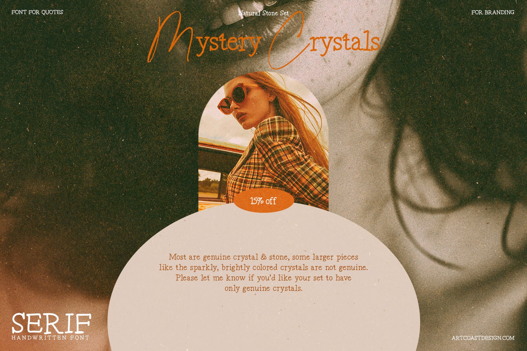
Why spend thousands on a custom logo when your font can do the work for you? SA Killeen comes packed with unique ligatures (connected letters) that turn standard words into bespoke wordmarks.
Use Case: Type out a client’s brand name in SA Killeen, toggle the discretionary ligatures, and suddenly, you have a logo that looks like it belongs on a bottle of French perfume.
Modern Handwritten Serif Font - SA Killeen
3. Perfect for the "Modern Bride"
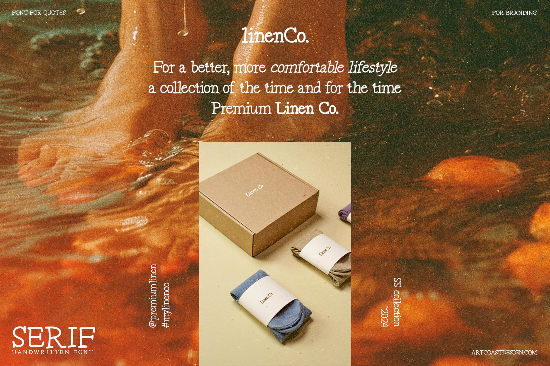
The wedding industry has moved away from messy, illegible calligraphy. Modern couples want editorial-style invitations that look like Vogue covers.
Design Tip: Pair SA Killeen (for names and headers) with a tiny, clean sans-serif (for the date and venue). This combination is timeless and photographs beautifully on textured paper.
Modern Handwritten Serif Font - SA Killeen
4. It Anchors Packaging Design
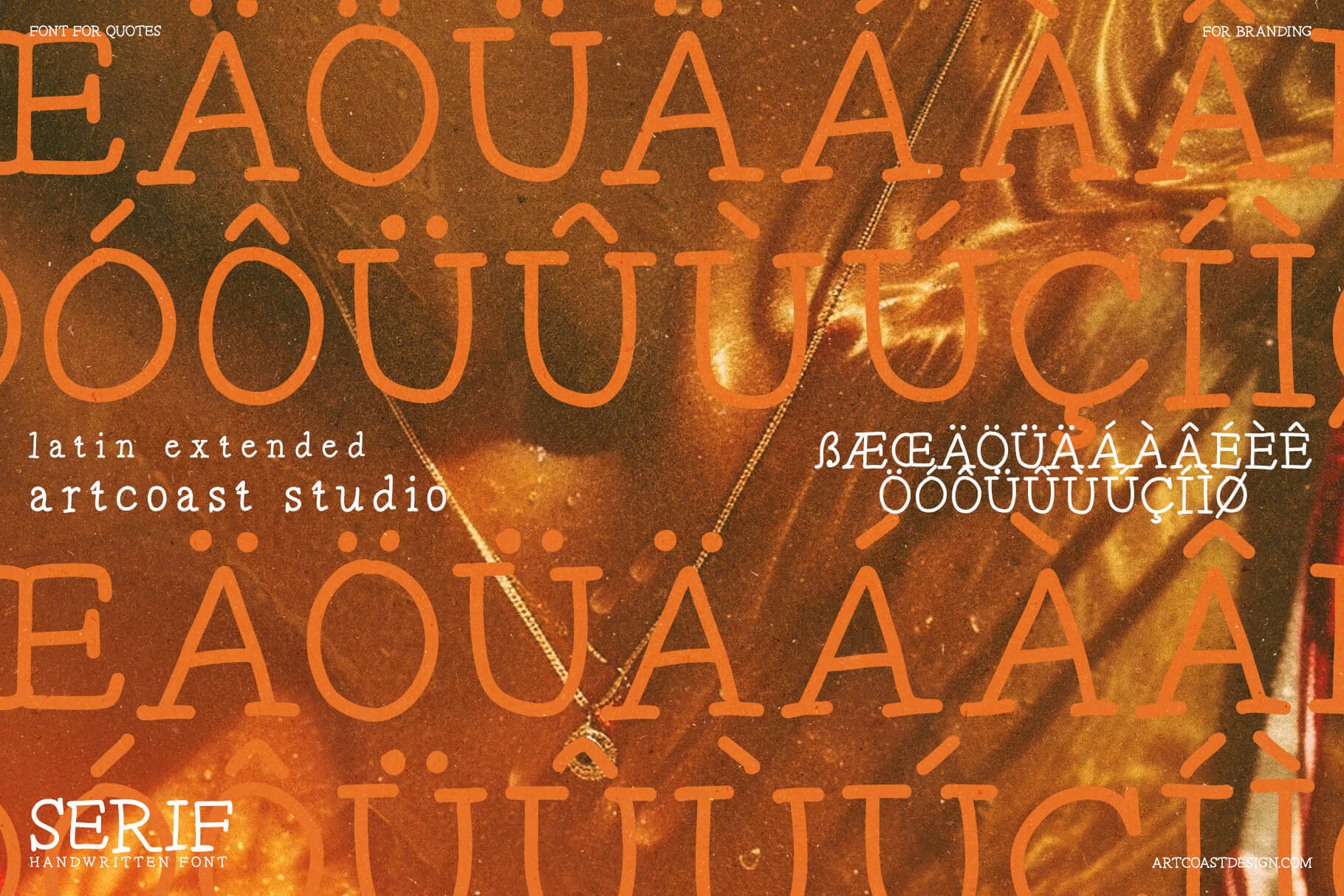
Whether you are designing for a skincare line, a candle brand, or an artisanal coffee shop, the packaging needs to build trust. Serifs like Killeen convey authority and heritage.
Pro Move: Use it in ALL CAPS with wide letter spacing (tracking set to +50 or +100) for a look that screams "Premium Quality."
Modern Handwritten Serif Font - SA Killeen
If you are tired of generic sans-serifs and want to add a touch of class to your portfolio, SA Killeen is the investment your toolkit needs. It bridges the gap between traditional elegance and modern edge.
Ready to elevate your designs? 👉 Get SA Killeen Modern Serif Here
Meet SA Opuntia, a cheerful handwritten font with bouncy letters, wobbly lines and a little bit of desert sun.
Every letter started as a sketch by Daniil Mashkin, a kid who loves cacti. We then cleaned up the outlines, rebuilt the spacing and added hundreds of kerning pairs, so the font works just as well in a big headline as on a tiny sticker.
SA Opuntia feels warm, honest and genuinely hand-made, perfect when you want your design to smile.
Perfect for:
children's books and educational materials
plant shops, cafés and farmers' market branding
packaging, labels and stickers
greeting cards, birthday invitations and party decor
social media posts, quotes and posters
handmade and DIY brands
Features:
Uppercase and lowercase letters, numbers and punctuation
Western European accented letters (À–ÿ)
Professional spacing and class-based kerning
Guillemets « », low quotes „ ‚ and en/em dashes
OTF format, works in Adobe apps, Figma, Canva, Procreate, Word, Keynote and more
What's included:
SAOpuntia-Regular.otf
Licensing
Desktop / Commercial license unlocks client branding, merchandise, packaging, and digital products
Support & Updates
Questions? Email hello@artcoastdesign.com — reply within 24 hours. Lifetime font updates included.