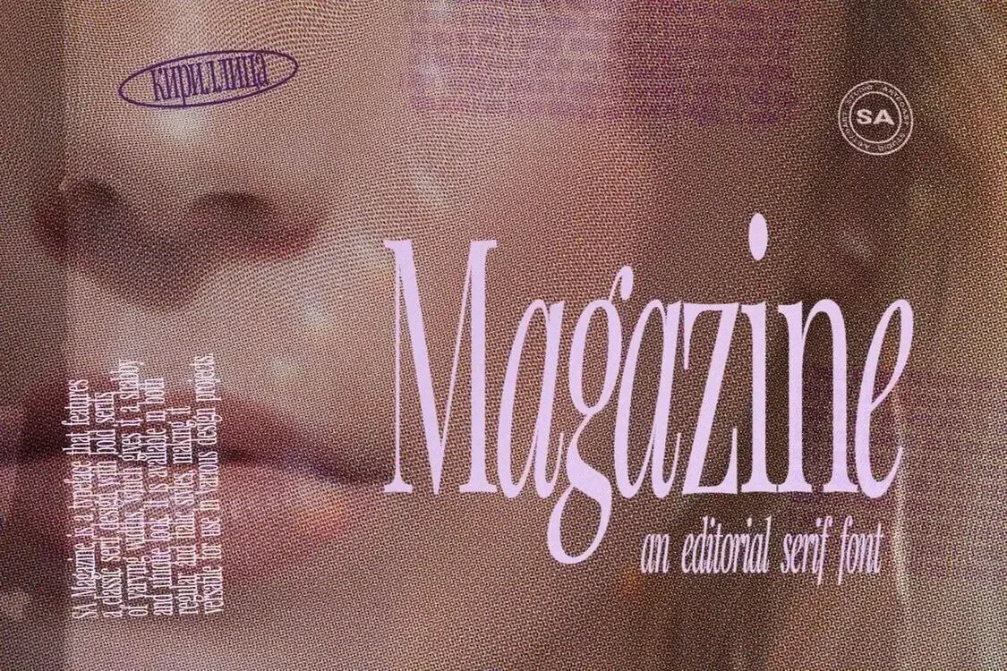
The "Sharp Serif" Trend: Why SA Céleri is the Editor’s Choice for 2026
If you scroll through the Instagram feeds of top design agencies in New York or Paris right now, you’ll notice a shift. Soft, bubbly fonts are out. Sharp, dangerous elegance is in.
We call this the "Spiky Serif" trend. It’s typography that looks like it could cut glass. It’s refined, but it has a bite.
At the forefront of this movement is SA Céleri.
This isn't just another serif font. It’s a statement piece. Here is why SA Céleri is becoming the go-to typeface for brands that want to look fiercely modern.
1. It’s "Dangerously" Elegant
Standard serifs are safe. SA Céleri is bold. Its defining features are its razor-sharp terminals and high-contrast strokes. It creates a visual tension that immediately grabs attention. It tells the viewer: "This brand is confident, expensive, and a little bit edgy."
Best For: High-fashion logos, perfume packaging, and luxury hotel branding.

SA Céleri — Modern Serif Font for Elegant Branding
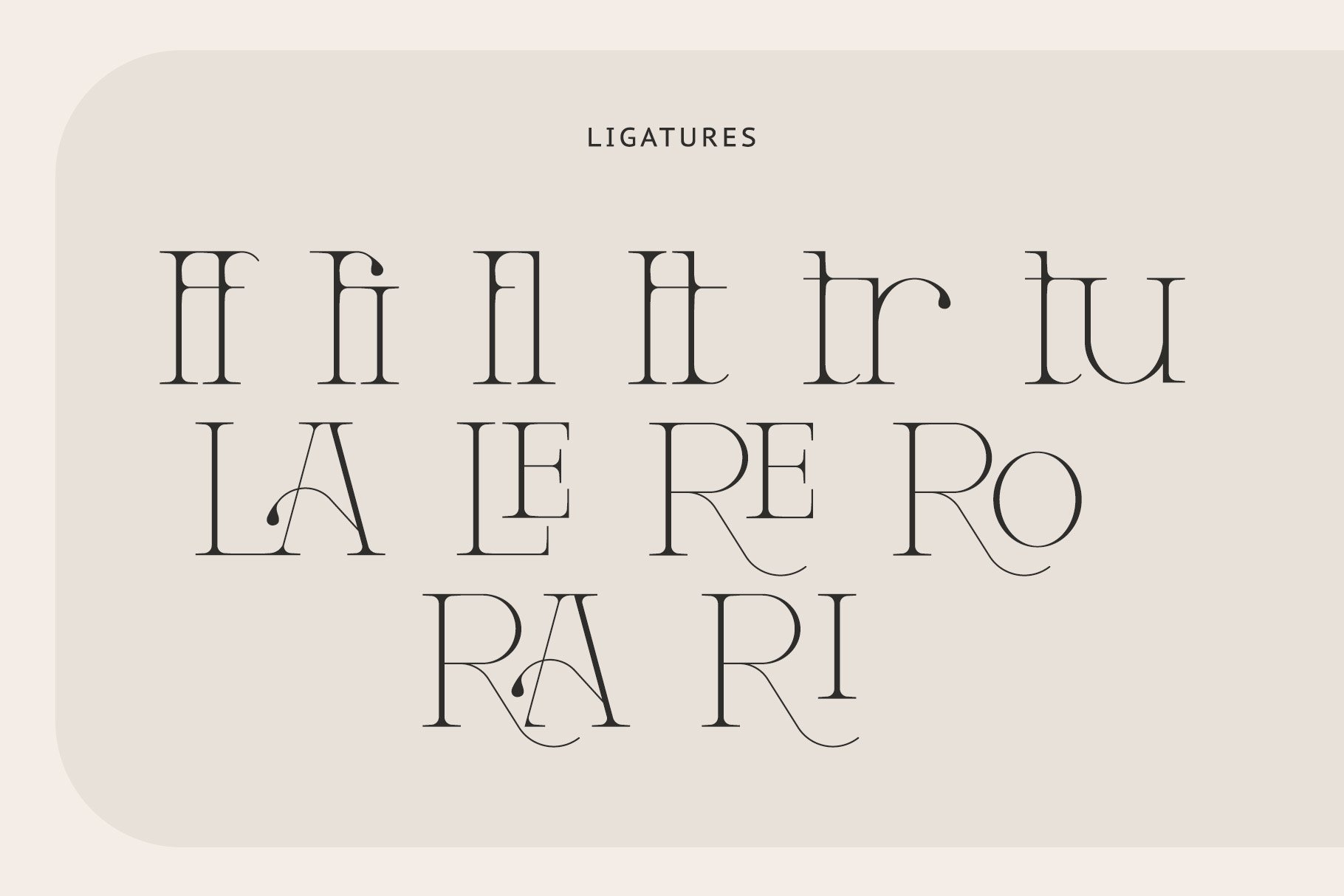
2. Ligatures That Do the Work for You
One of the biggest struggles in branding is making a wordmark look unique without redrawing every letter. SA Céleri comes packed with stylistic ligatures (connected letters) that flow into each other like liquid.
Pro Tip: Type out your headline or brand name, open your Glyphs panel, and swap standard characters for the ligature versions. Instantly, you have a custom typographic logo that looks like it cost $5,000 to design.
3. It Cuts Through the Noise
In a digital world full of minimal sans-serifs (the "tech bro" look), a sharp serif acts as a visual disruptor. Using SA Céleri for a headline on a website or a social media post signals a return to craft and heritage, but with a futuristic twist. It pairs perfectly with minimalist photography and negative space.

SA Céleri — Modern Serif Font for Elegant Branding
4. How to Pair It
Because SA Céleri has so much personality, it likes to be the star of the show.
The Header: SA Céleri (Large, All Caps or Sentence Case).
The Body Text: A clean, geometric sans-serif (like Helvetica or a simple Grotesk).
The Result: A layout that looks like a page from Harper’s Bazaar or Vogue.
If you are working on a project that needs to feel premium but not "stiff," SA Céleri is your weapon of choice. It brings the romance of classic typography and sharpens it for the modern age.
SA Céleri — Modern Serif Font for Elegant Branding
Don't just type. Make a statement.