
In a world where AI can generate "perfect" imagery in milliseconds, the design community in 2026 has made a collective pivot toward The New Sincerity. We are craving the tactile, the imperfect, and the human. Enter SnipClip—a typeface that doesn’t just sit on a screen; it feels like it was cut from your favorite cardstock.
The Paper-Cut Aesthetic: A Rebellion Against Pixels
The beauty of SnipClip lies in its DNA. Inspired by the traditional art of paper-cut collage, every letterform carries those charming, deliberate irregularities you only get when a pair of scissors meets physical paper.
In 2026, this "handmade" look is the ultimate premium. It signals to your audience that a human hand—and a human heart—was involved in the creative process.
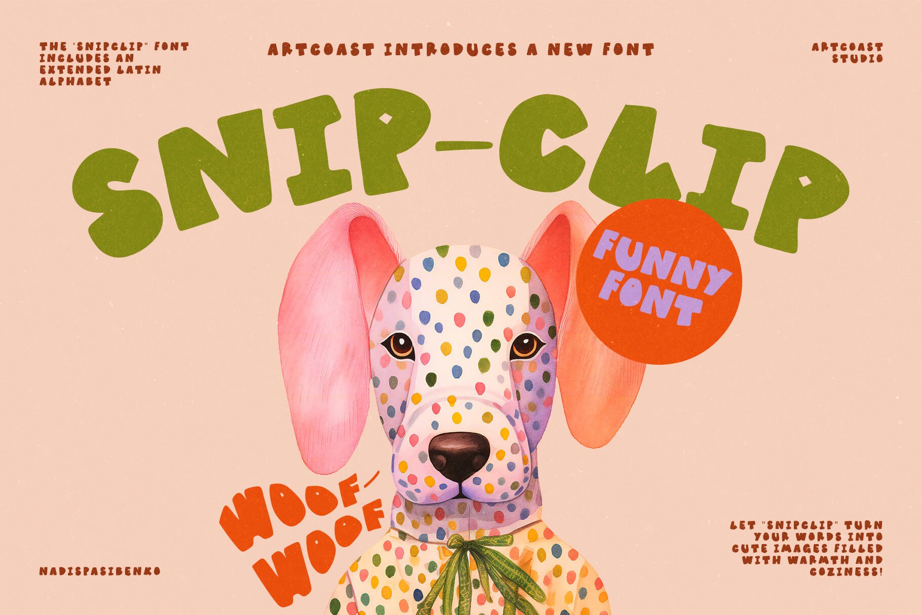
Why SnipClip is a 2026 Must-Have
1. Tactile Realism
Digital design is no longer just about flat colors. SnipClip brings a sense of physical weight. When paired with subtle shadows or paper textures (like our Texture Packs), it creates a 3D "pop" that stands out in a crowded digital feed.
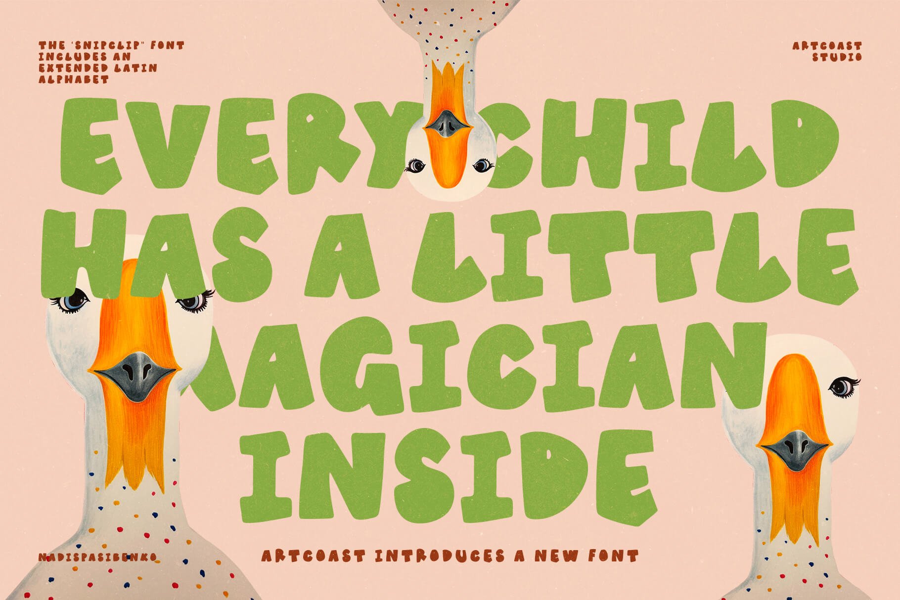
2. The Psychology of Play
Post-AI-saturation, brands are using playfulness to build trust. SnipClip’s bouncy, irregular baseline and soft edges feel approachable and safe. It’s the perfect antidote to the cold, sterile corporate fonts of the past decade.
3. High Contrast & Character
SnipClip is a "Display Font" with a soul. It’s bold enough to grab attention on an 8K billboard but carries enough intricate detail to look stunning in close-up editorial layouts.
Where to Use SnipClip (Inspiration for your next project)
Eco-Conscious Packaging: The organic, "scrappy" look of SnipClip is a match made in heaven for sustainable brands and craft industries.
Dynamic Social Content: In the fast-paced world of 2026 video content (TikTok/Veo), typography needs to feel alive. SnipClip’s energetic shapes make captions feel like they are part of the story.
Modern Branding: Use it for "lifestyle" brands—from coffee shops to tech startups that want to appear more "human" and less "Silicon Valley."
Apparel & Merch: It’s the ideal choice for statement tees, tote bags, and ceramic branding where you want a "screen-printed" vibe.

The Technical Details
SnipClip isn't just a pretty face; it’s a workhorse. It comes in OTF, TTF, and WOFF formats, making it ready for everything from Adobe Creative Cloud and Procreate to high-performance web environments. It pairs beautifully with minimalist sans-serifs (like our Atlantic Ocean) to create a balanced, professional contrast.
If your 2026 mood board is full of textures, organic shapes, and a desire to connect on a human level, SnipClip is your missing piece. It’s a manifesto against digital boredom.
Ready to give your designs a heartbeat?
Meet SA Opuntia, a cheerful handwritten font with bouncy letters, wobbly lines and a little bit of desert sun.
Every letter started as a sketch by Daniil Mashkin, a kid who loves cacti. We then cleaned up the outlines, rebuilt the spacing and added hundreds of kerning pairs, so the font works just as well in a big headline as on a tiny sticker.
SA Opuntia feels warm, honest and genuinely hand-made, perfect when you want your design to smile.
Perfect for:
children's books and educational materials
plant shops, cafés and farmers' market branding
packaging, labels and stickers
greeting cards, birthday invitations and party decor
social media posts, quotes and posters
handmade and DIY brands
Features:
Uppercase and lowercase letters, numbers and punctuation
Western European accented letters (À–ÿ)
Professional spacing and class-based kerning
Guillemets « », low quotes „ ‚ and en/em dashes
OTF format, works in Adobe apps, Figma, Canva, Procreate, Word, Keynote and more
What's included:
SAOpuntia-Regular.otf
Licensing
Desktop / Commercial license unlocks client branding, merchandise, packaging, and digital products
Support & Updates
Questions? Email hello@artcoastdesign.com — reply within 24 hours. Lifetime font updates included.