
Typography is the art and practice of arranging typefaces to create visual messages. It’s an essential part of effective communication, from marketing materials to books and even signage around town. But typography goes beyond just choosing the right font size—it can shape how people perceive and make sense of the world around them. In this blog post, we’ll explore how typography affects our perception of the world.
The Power of Fonts
The power of fonts is often underestimated, but it’s a crucial element in conveying meaning. Different fonts evoke different emotions; for example, serif fonts appear more traditional and timeless, while sans serif fonts are associated with modernity and simplicity. You can also use certain fonts to emphasize certain words or phrases; by making them bold or italicizing them, you can draw attention to important points without needing to resort to all-caps shouty text.

Typography as Visual Cues
Typography plays an important role in conveying information quickly and efficiently. For example, when writing headlines or titles, a larger font size will draw more attention than a smaller one. Similarly, using all caps allows readers to skim the text quickly so they can get the gist without having to read it in full (think billboards or posters). And italics can be used to add emphasis or highlight something important. These subtle visual cues help readers make sense of textual information at a glance.
The Psychology Behind Font Choices
Font choices also have psychological implications; as mentioned earlier, different fonts evoke different emotions depending on their design features. For instance, script-based fonts tend to be associated with sophistication and elegance, while blocky typefaces are often seen as strong and authoritative (think Arial vs Times New Roman). By understanding how certain font styles affect people’s emotions and perceptions, designers can create designs that best reflect their brand identity and message.
Typography plays an essential role in helping us make sense of the world around us—from conveying meaning quickly through visual cues to evoking specific emotions with carefully chosen font styles. By understanding how typography affects our perception of the world, designers can create designs that are both aesthetically pleasing and meaningful for their audience. The power of typography lies not only in its ability to convey information but also its ability to shape our worldview—and for designers looking for ways to stand out from their competition, that makes it an invaluable tool indeed!
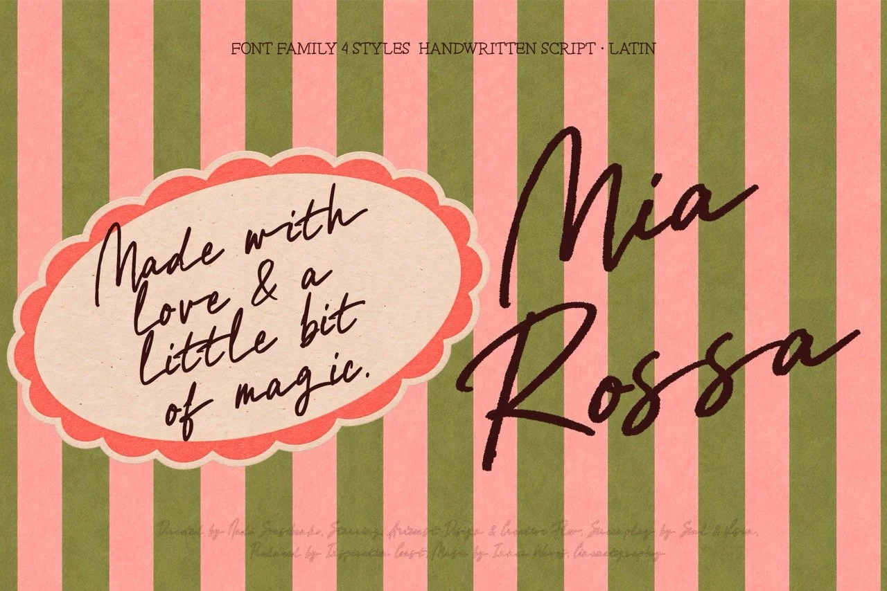
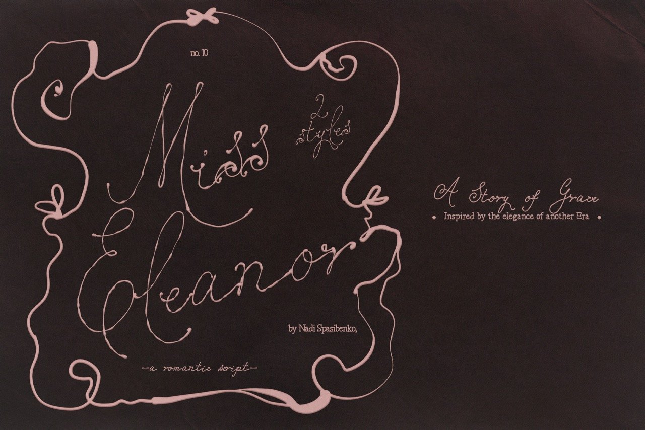
Meet SA Opuntia, a cheerful handwritten font with bouncy letters, wobbly lines and a little bit of desert sun.
Every letter started as a sketch by Daniil Mashkin, a kid who loves cacti. We then cleaned up the outlines, rebuilt the spacing and added hundreds of kerning pairs, so the font works just as well in a big headline as on a tiny sticker.
SA Opuntia feels warm, honest and genuinely hand-made, perfect when you want your design to smile.
Perfect for:
children's books and educational materials
plant shops, cafés and farmers' market branding
packaging, labels and stickers
greeting cards, birthday invitations and party decor
social media posts, quotes and posters
handmade and DIY brands
Features:
Uppercase and lowercase letters, numbers and punctuation
Western European accented letters (À–ÿ)
Professional spacing and class-based kerning
Guillemets « », low quotes „ ‚ and en/em dashes
OTF format, works in Adobe apps, Figma, Canva, Procreate, Word, Keynote and more
What's included:
SAOpuntia-Regular.otf
Licensing
Desktop / Commercial license unlocks client branding, merchandise, packaging, and digital products
Support & Updates
Questions? Email hello@artcoastdesign.com — reply within 24 hours. Lifetime font updates included.