5 Typography Trends That Will Define Branding in 2026
As 2025 draws to a close, the design world is already looking forward. If 2024 was about nostalgia, 2026 is shaping up to be the year of bold futurism and expressive minimalism.
We are seeing a shift away from safe, neutral sans-serifs (goodbye, generic tech vibes) toward fonts that have a distinct voice. Brands today need to be loud, or they need to be incredibly elegant. There is no middle ground.
We’ve curated 5 fonts from our collection that perfectly embody the visual identity trends coming your way.
1. The "Wide & Loud" Trend
Wide fonts are taking over websites and streetwear. They exude confidence and stability. It’s a look that says, "We are established, and we take up space."

Triumph Wide Font — Bold Sans-Serif
The Font: Triumph Wide
Why it works: It’s geometric, massive, and impossible to ignore. It works best for short, punchy headlines on landing pages or architectural branding.
Use it for: Tech startups, streetwear labels, or architectural firms. 👉 Get Triumph Wide Font
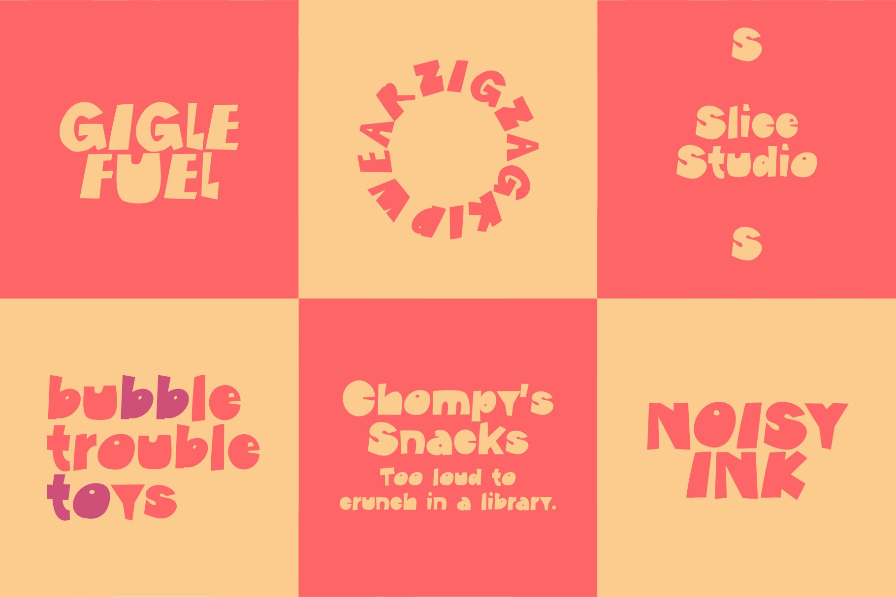
2. The "Anti-Design" Trend
Perfection is boring. The Gen Z audience loves "controlled chaos"—typography that breaks the grid, mixes weights, or looks like it was done in a rush (even though it took hours).
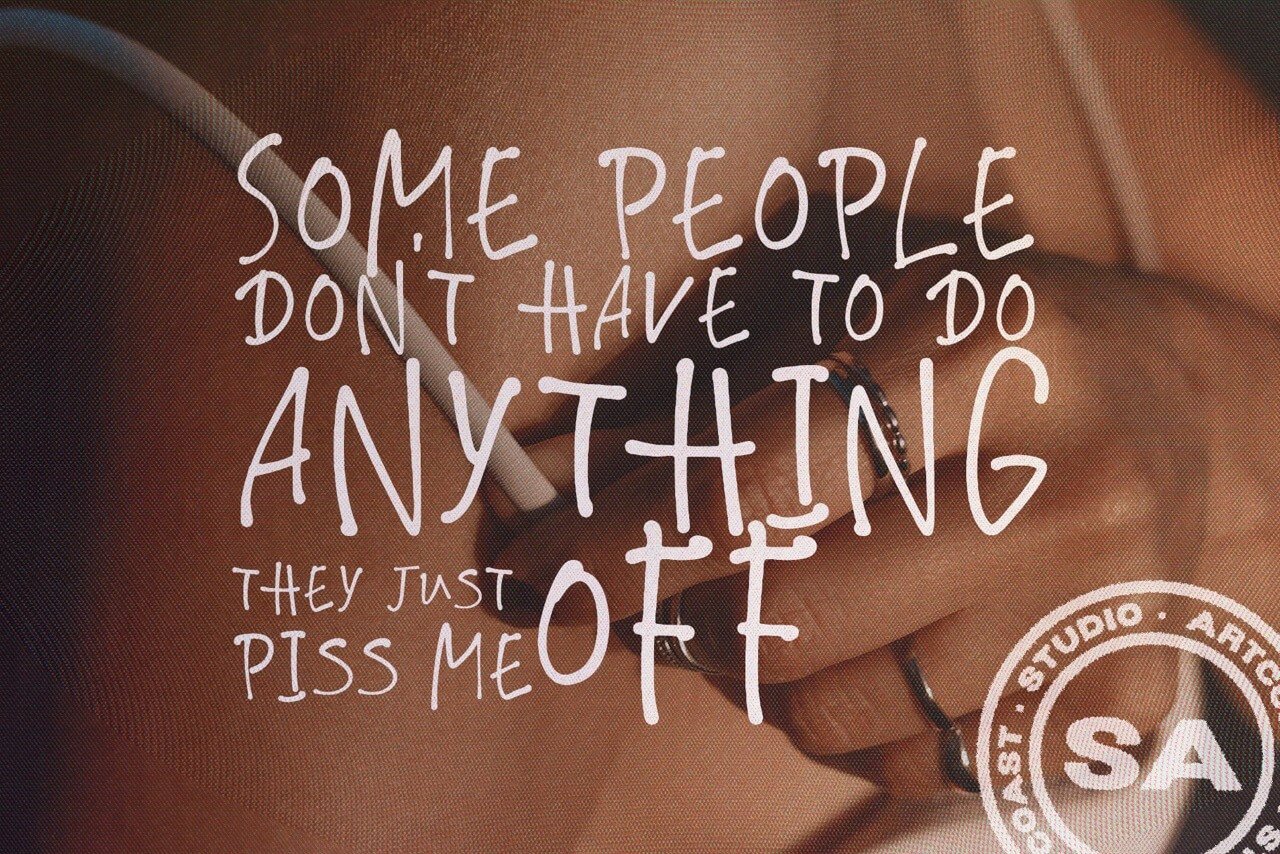
SA No Rules Handwriting Font – Cyrillic & Latin Extended
The Font: SA No Rules
Why it works: It mimics the raw energy of marker on paper. It feels rebellious and authentic, perfect for brands that want to disrupt the market.
Use it for: Music festival posters, skateboard brands, or protest art. 👉 Get SA No Rules Display Font
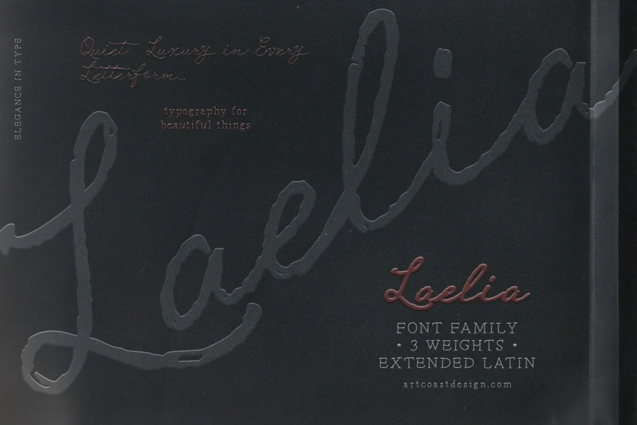
3. The "Timeless Luxury" Trend
Serifs aren't going anywhere, but they are becoming more refined. The "New Editorial" look is about sophistication—blending modern flair with classic proportions.
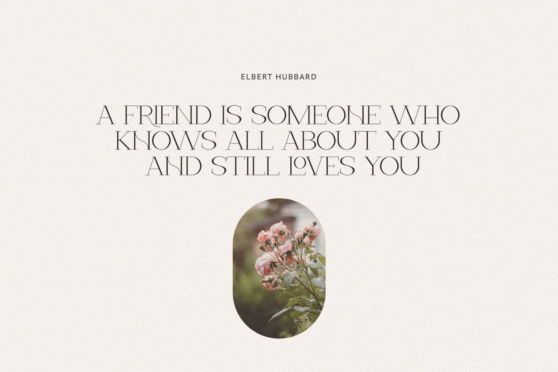
Verona Elegant Display Serif: Create Stunning Designs
The Font: Verona Elegant Display Serif
Why it works: Verona brings the sophistication of a high-end fashion magazine to digital branding. It’s clean, legible, but undeniably expensive-looking.
Use it for: Skin care packaging, museum identities, or luxury real estate. 👉 Get Verona Elegant Serif
4. The "Paper Cut" Trend (Tactile Design)
In a digital world, we crave texture. Fonts that look "made by hand" or cut from paper are becoming a huge trend for brands that want to stand out from AI-generated smoothness.
SA Paper Cut - Bold Handcut Display Typeface
The Font: SA Paper Cut
Why it works: It’s bold, angular, and looks physically cut out. It turns a simple word into a graphic element immediately. It’s playful yet brutalist.
Use it for: Creative agencies, coffee shops, or craft packaging. 👉 Get SA Paper Cut Display Font
5. The "Modern Organic" Trend
Sustainability is huge, and it has a "look." It’s no longer just about soft curves; it’s about strong, display typography that feels grounded and earthy.

Create Stunning Logos and Headlines with Woodland Hills Display Font
The Font: Woodland Hills
Why it works: With its strong display presence, Woodland Hills captures the essence of modern outdoor aesthetics. It feels adventurous and solid.
Use it for: Camping gear, organic food brands, or travel blogs. 👉 Get Woodland Hills Display Font
If you are planning a rebrand or updating your portfolio, focus on character. Don't settle for neutral. Pair the wide, industrial look of Triumph with the handcrafted vibe of SA Paper Cut. 2026 is about mixing these opposites to create something new.
Upgrade your design toolkit today. Browse All Fonts