Color in Branding: A Guide for Graphic Designers
Branding is a paramount intangible asset for every company. The decision to buy or not to buy a product is often made within a mere 1.5 seconds. As designers, we understand the importance of packaging, label design, and, notably, the color palette in capturing consumers' attention. However, in an increasingly competitive market, new brands face the challenge of standing out and attracting potential customers. This is where effective rebranding and captivating visual identities come into play.
To create powerful associations with consumers, designers strategically utilize colors in branding. For instance, when designing food products, using soft shades of blue can effectively communicate a low-calorie offering. Conversely, employing vibrant hues of orange, red, or burgundy can convey richness and satisfaction.
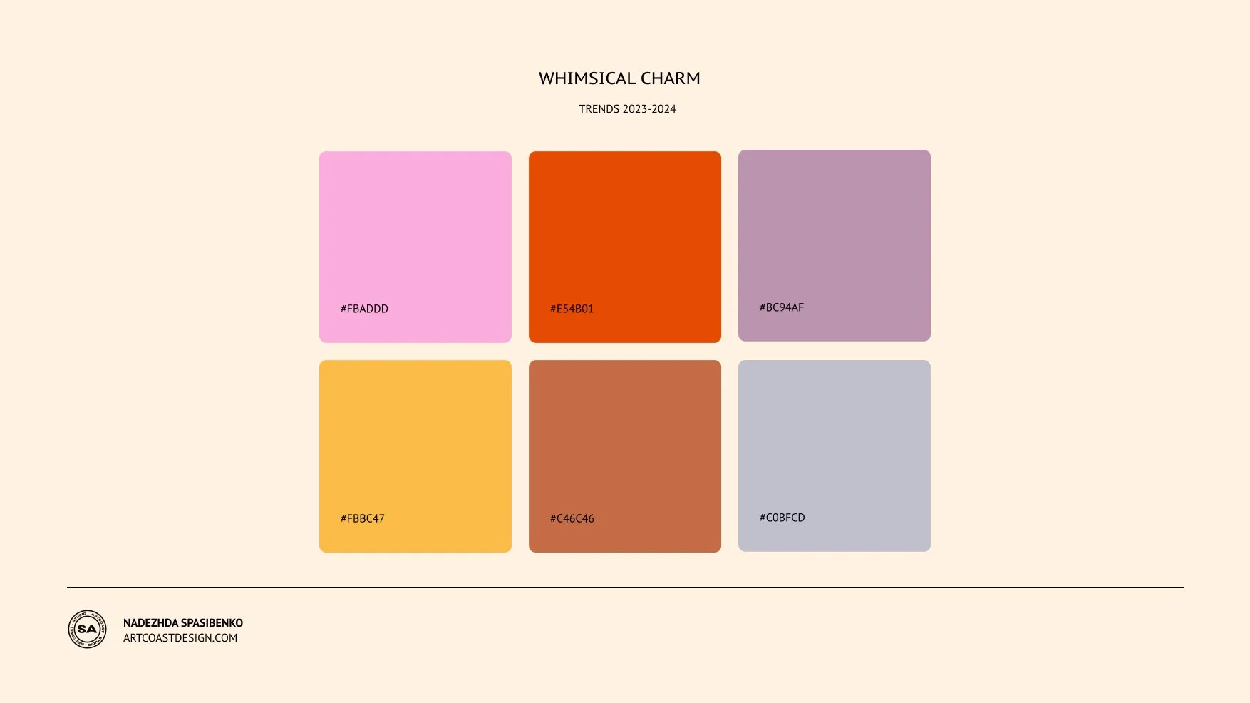
Color Palette Trend 2023
When it comes to products associated with cleanliness, pink tones can be leveraged to create a sense of purity in labels and packaging. On the other hand, establishing a premium brand calls for the use of complex and deep shades such as black, gold, various shades of beige, brown, or green.
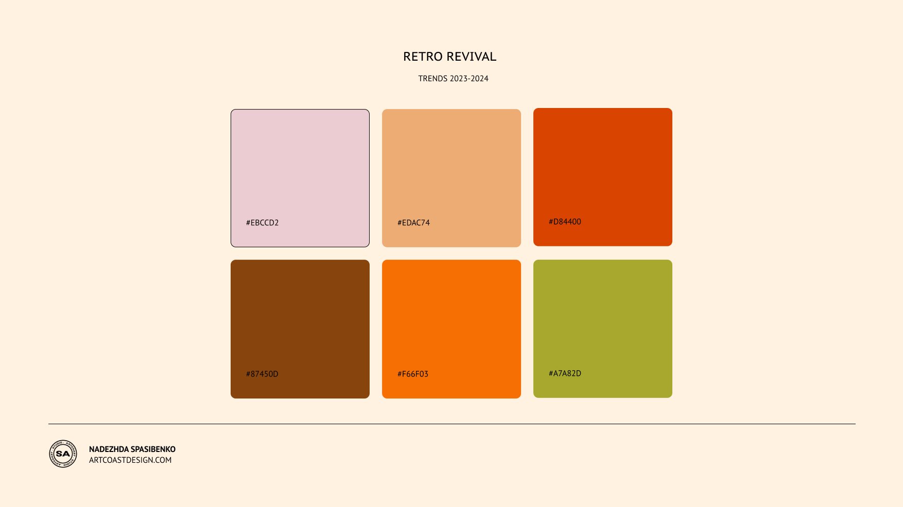
Color Palette Trend 2023
It is essential for designers to familiarize themselves with the fundamental principles and laws of color in branding. Factors such as contrast, saturation, and other elements play crucial roles in creating impactful visual experiences.
Color Palette Trend 2023
The temperature of color also significantly influences brand perception. Cool shades inherently evoke a sense of lightness and tend to recede into the background. Warm colors, on the other hand, carry a heavier visual weight, stimulate appetite, and evoke associations of coziness and warmth.
Color Palette Trend 2023
Understanding the concept of saturation is vital in communicating brand messages effectively. Subdued shades consistently evoke feelings of tranquility, serenity, harmony, and balance. However, it's important to note that certain muted shades of purple may inadvertently elicit depressive emotions. On the contrary, bright and highly saturated palettes are often employed to convey dynamism, activity, youthfulness, and liveliness.
Color Palette Trend 2023
When designing for different age groups, color choices should be adapted accordingly. For newborn clothing, a subdued and softer palette can create a gentle and soothing ambiance. However, for older children, incorporating brighter and more dynamic shades can evoke excitement and capture their attention.
As graphic designers, mastering the art of color in branding enables us to create compelling visual narratives that resonate with consumers. By strategically selecting and implementing color schemes based on their psychological impact, we can effectively communicate brand values and capture the attention of target audiences.
Remember, in the world of branding, color is not just an aesthetic choice; it's a powerful tool that can shape perceptions, evoke emotions, and ultimately drive consumer behavior.


