The "Neo-Print" Revolution: Why Halftone Textures Are Dominating 2026 Design
Design trends move like a pendulum. For the last two years, we’ve been drowning in "Glassmorphism," 3D clay renders, and smooth, hyper-realistic AI-generated art. Everything is shiny. Everything is perfect.
And frankly? Designers are bored.
As we look toward 2026, the pendulum is swinging back hard. The biggest visual trend emerging right now is "The Neo-Print Aesthetic." It’s gritty, industrial, and raw. It celebrates the imperfections of old printing presses—the ink bleed, the misaligned registration, and most importantly: The Dot.
Here is why Dotted Halftone Textures are the essential toolkit you need to stay relevant next year.
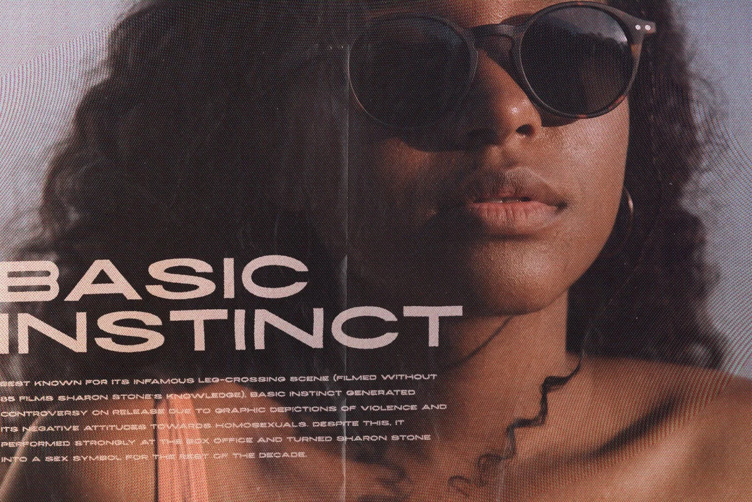
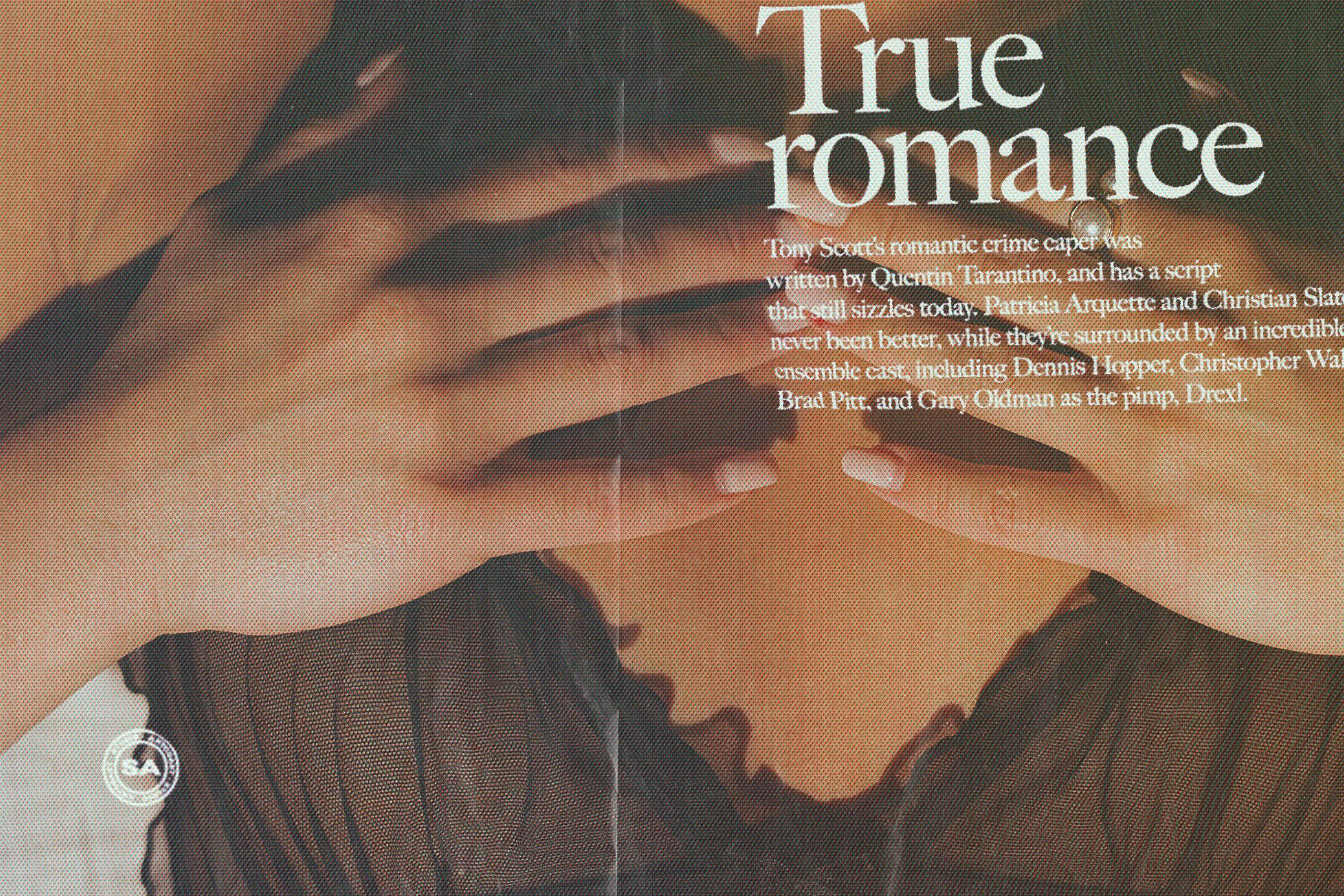
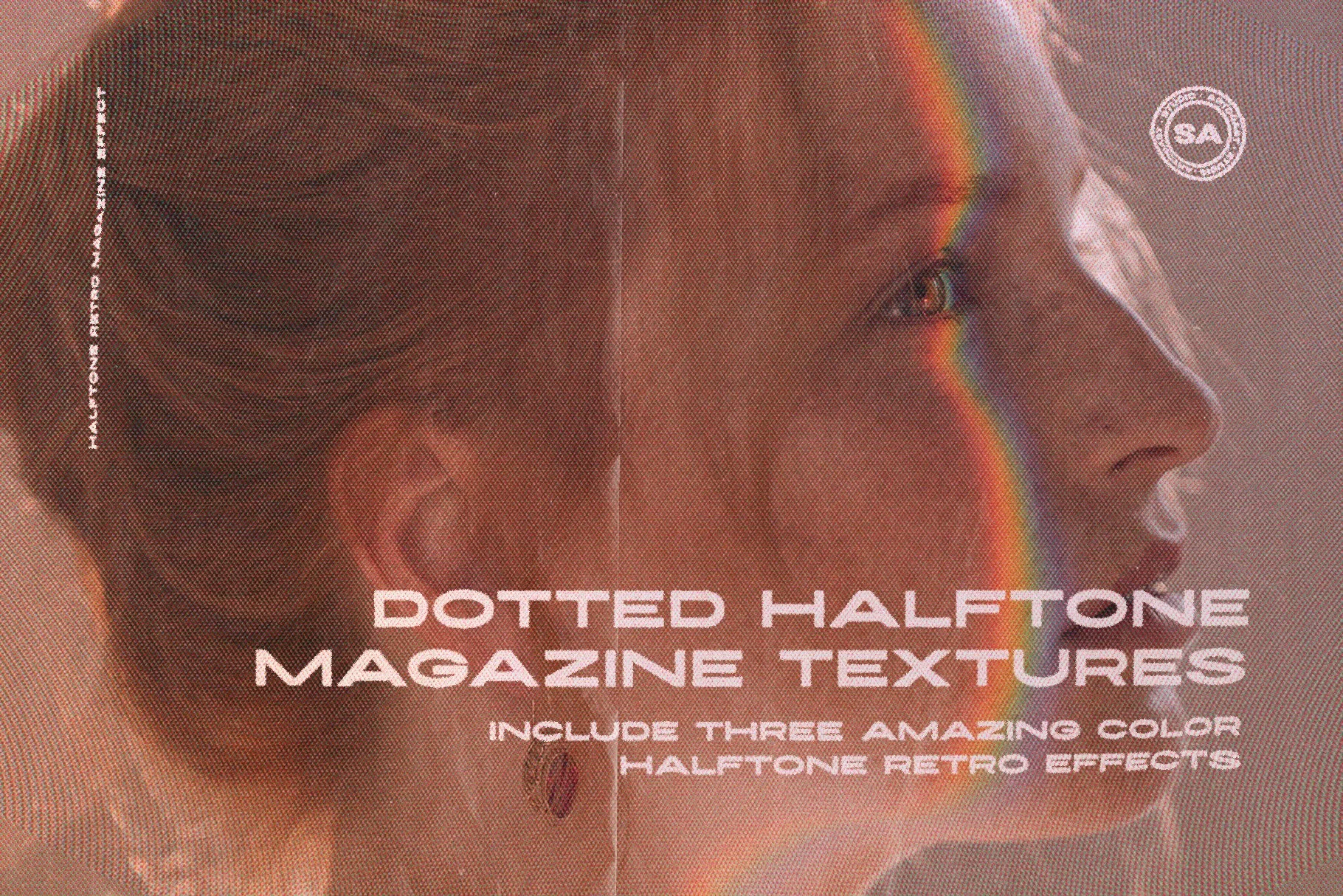
Vintage Dotted Halftone Magazine Textures
1. It’s the "Anti-AI" Aesthetic
In an era where anyone can generate a "perfect" image in seconds, perfection has lost its value. Texture adds soul. Applying a rough halftone overlay to a photo instantly signals to the viewer: "A human made this." It breaks the digital smoothness and adds a layer of tactile history that algorithms struggle to replicate convincingly.
2. From "Retro" to "Industrial"
Don't confuse this with the vintage trends of 2015. The 2026 Halftone trend isn't about making things look like old comics. It’s about Brutalism. Top tech brands and streetwear labels (think Nothing, Teenage Engineering, or Off-White) use halftones to look technical and engineered. It’s not nostalgic; it’s utilitarian.
Vintage Dotted Halftone Magazine Textures
3. How to Use These Textures (Without Looking Dated)
Our Dotted Halftone Magazine Textures pack was built specifically for this modern workflow. Here is how to apply them to 2026 standards:
The "Acid Graphics" Poster: Take a high-contrast photo, desaturate it to black and white, and apply a heavy Halftone texture. Layer neon green or safety orange typography on top. This contrast between "lo-fi grain" and "hi-fi color" is the defining look of modern rave and event posters.
The "Streetwear" Mockup: Designing t-shirts? Clean vectors look like stickers. Applying a subtle halftone distress effect makes the print look like it’s actually embedded in the fabric. It adds value to the presentation.
The "Glitch" Branding: Use the textures as a mask. Instead of a solid logo, let your logo emerge from a field of chaotic dots. It adds motion and energy to static branding.
Vintage Dotted Halftone Magazine Textures
4. Why This Pack?
You could try to make halftones manually in Photoshop by converting images to bitmap and messing with frequency settings. But that takes time and destroys your original image. Our pack is drag-and-drop. It gives you high-resolution, magazine-quality dot patterns that are ready to go. You get the aesthetic of a 1990s Xerox machine with the resolution of a 2026 retina display.
Clean is out. Gritty is in. If you want your portfolio to look cutting-edge this year, stop polishing your pixels and start destroying them.
Get the look. 👉 Shop Dotted Halftone Magazine Textures