Why Your Lettering Looks "Off" (And the One Tool to Fix It Instantly)
Have you ever spent an hour drawing a quote on your iPad, only to zoom out and realize... something is wrong? Maybe the word "Hello" is huge, but "World" is tiny. Maybe the whole sentence is tilting to the right. Or maybe the spacing just feels awkward.
You try to fix it with the Liquify tool, but it just makes it worse.
Here is the hard truth: Great lettering isn't about beautiful curves. It’s about boring structure. Before a professional artist draws a single decorative swash, they spend 20 minutes drawing lines, measuring heights, and building a "skeleton" for their words.
But let’s be honest—nobody wants to spend 20 minutes drawing ruler lines on a digital canvas. That kills the creative flow.
The "Cheat Code" for Perfect Composition
We realized that the hardest part of lettering isn't the drawing—it’s the layout. So we solved it.
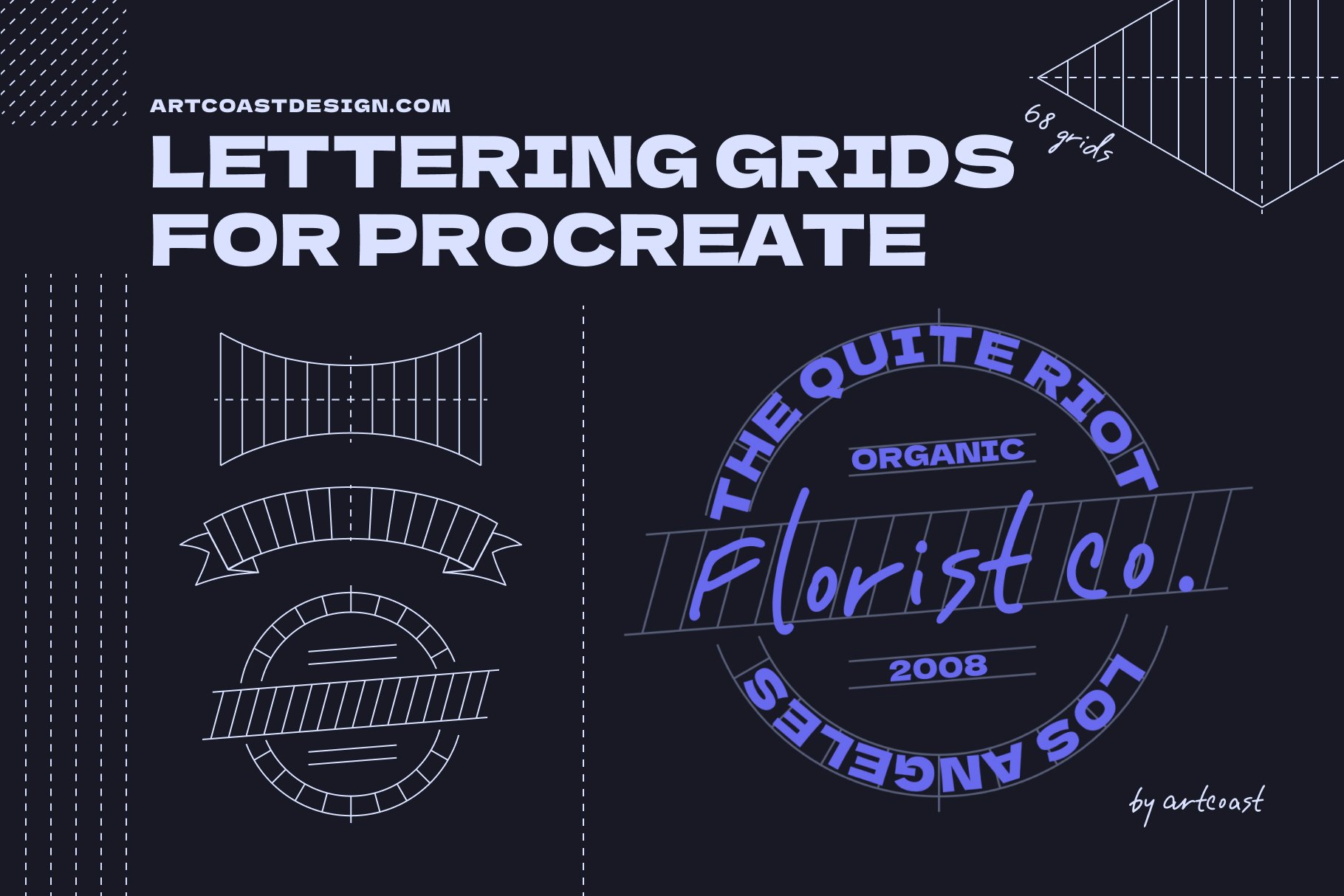
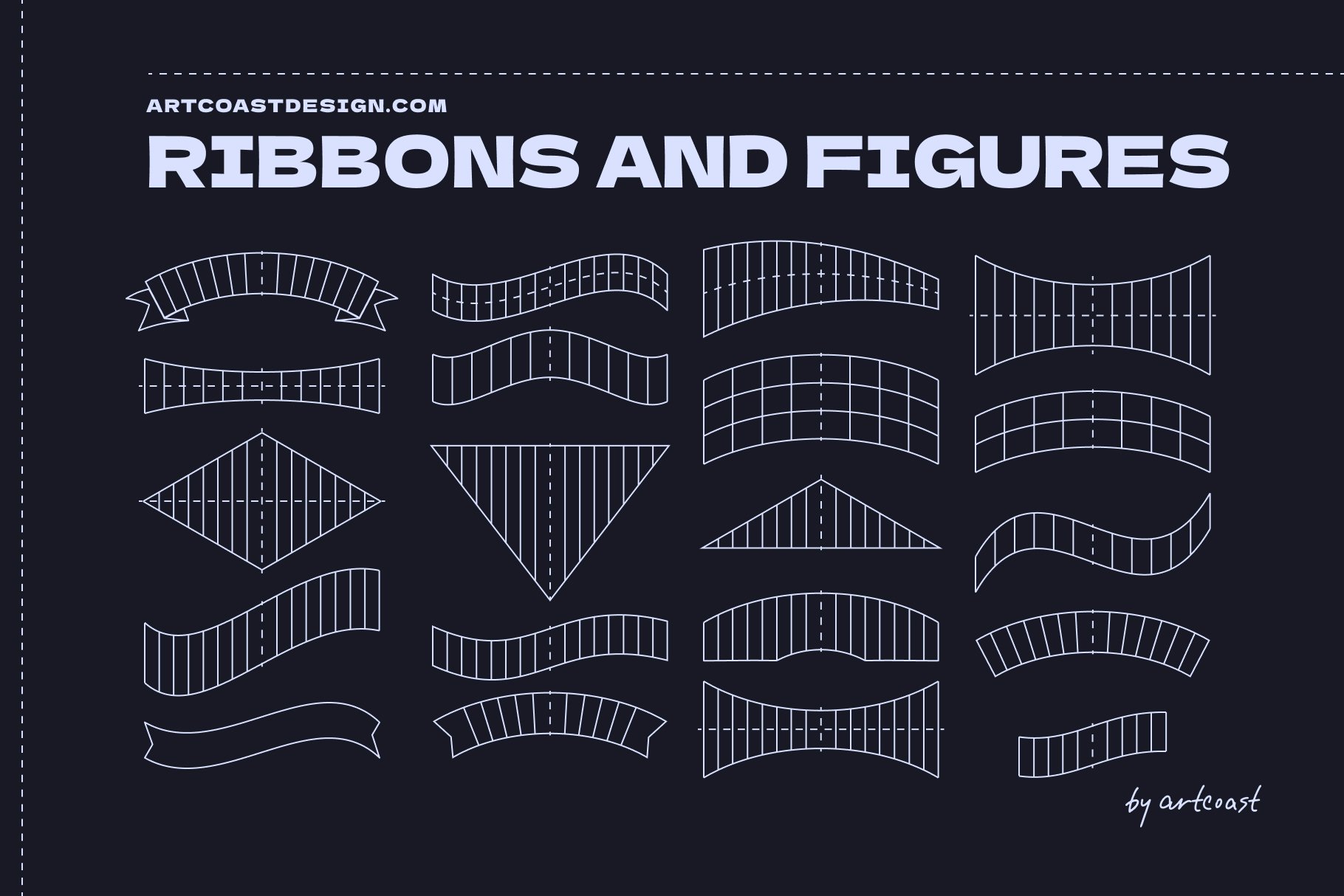
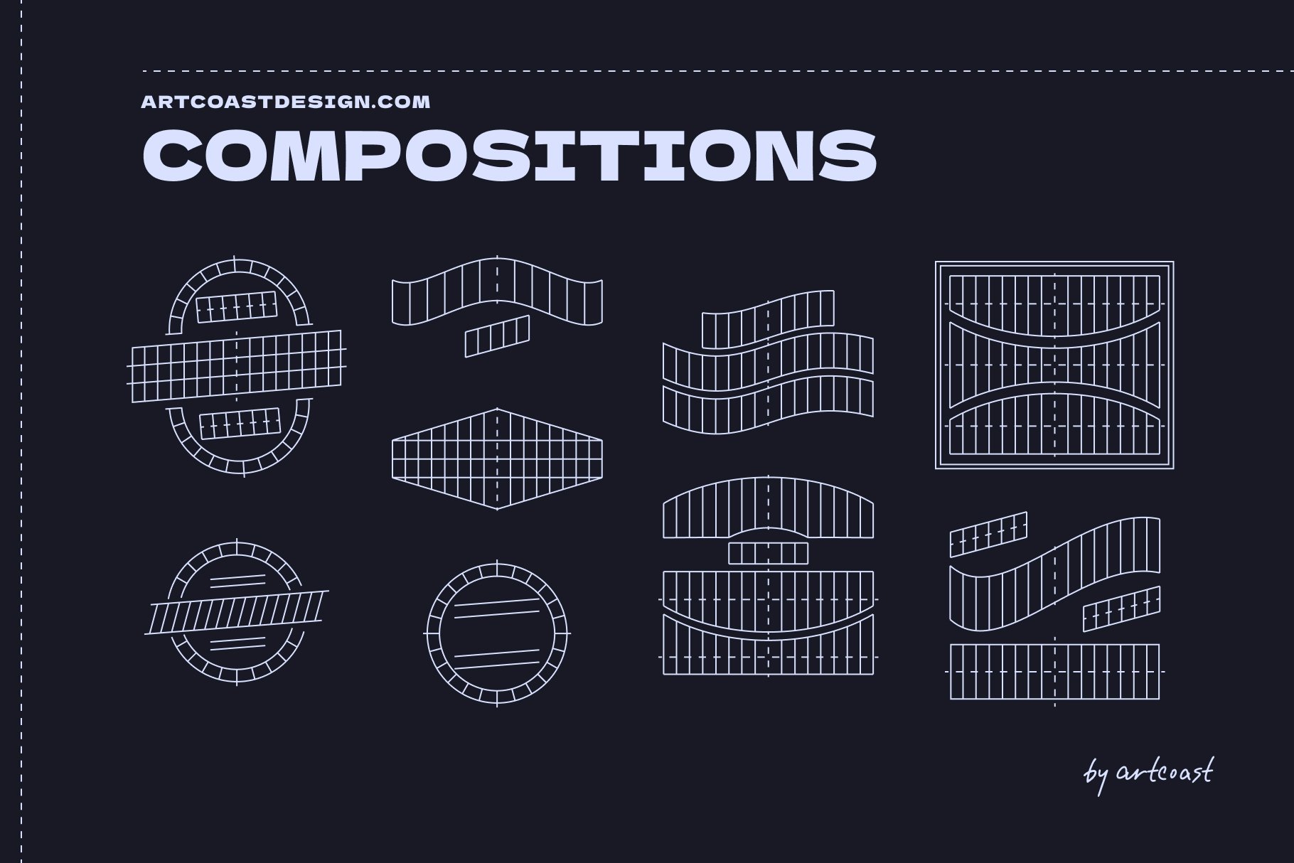
Meet the Procreate Lettering Grids Set. Think of these not as brushes, but as digital foundations. Instead of staring at a blank white screen and guessing where the center is, you just tap the screen once, and boom—you have a professional layout ready to go.
How It Changes Your Workflow:
1. Stop Drawing Crooked Lines
The set includes diverse grid shapes—from standard horizontal lines to complex arches, waves, and banners. You stamp the grid, lower the opacity, and draw your letters inside the boxes. It’s like bowling with bumpers. You literally cannot go off-track.
Professional Procreate Lettering Grids Set
2. Master "bouncy" and "Warped" Styles
Have you seen those cool vintage designs where the text fits into a flag or a diamond shape? Drawing that perspective manually is a nightmare of geometry. With our grids, you just pick the "Diamond Shape" stamp, and fill it in. The grid forces your letters into the right perspective automatically.
Professional Procreate Lettering Grids Set
3. It’s a Time Machine
If you do client work (logos, t-shirt designs, posters), speed is money. Creating a layout from scratch takes 15-30 minutes. Stamping a grid takes 2 seconds. You can show a client 5 different layout options in the time it usually takes to sketch one.
From Blank Canvas to Masterpiece in 3 Steps
Pick a Grid: Choose a simple baseline or a complex shape (like a circle or heart). Stamp it on a new layer.
Sketch: Choose a rough pencil brush and sketch your letters following the guidelines. Don't worry about details yet; just fill the space.
Ink: Create a new layer on top and draw your final clean lines. Delete the grid layer.
Professional Procreate Lettering Grids Set
Result: A perfectly balanced, professional typographic composition that looks like it took hours to measure out.
You don't need "steadier hands" to get better at lettering. You just need a better map. Stop fighting the blank canvas. Give your letters a skeleton, and watch your style improve overnight.